Back to all work
Unofficial conceptProduct photographyArt direction
Product photography built around a color system
Self-initiated concept for Aura-Soma, not commissioned
- Client
- Concept, not commissioned by the brand
- Role
- Art director and product imagery
- Year
- 2026
- Deliverables
- Three art-directed product scenes
The challenge
Aura-Soma organizes its whole catalogue by color, so color is the product, not a detail.
The problem
Generic studio shots flatten that. Every bottle reads as the same bottle in a different tint, and the meaning of each formula disappears.
The solution
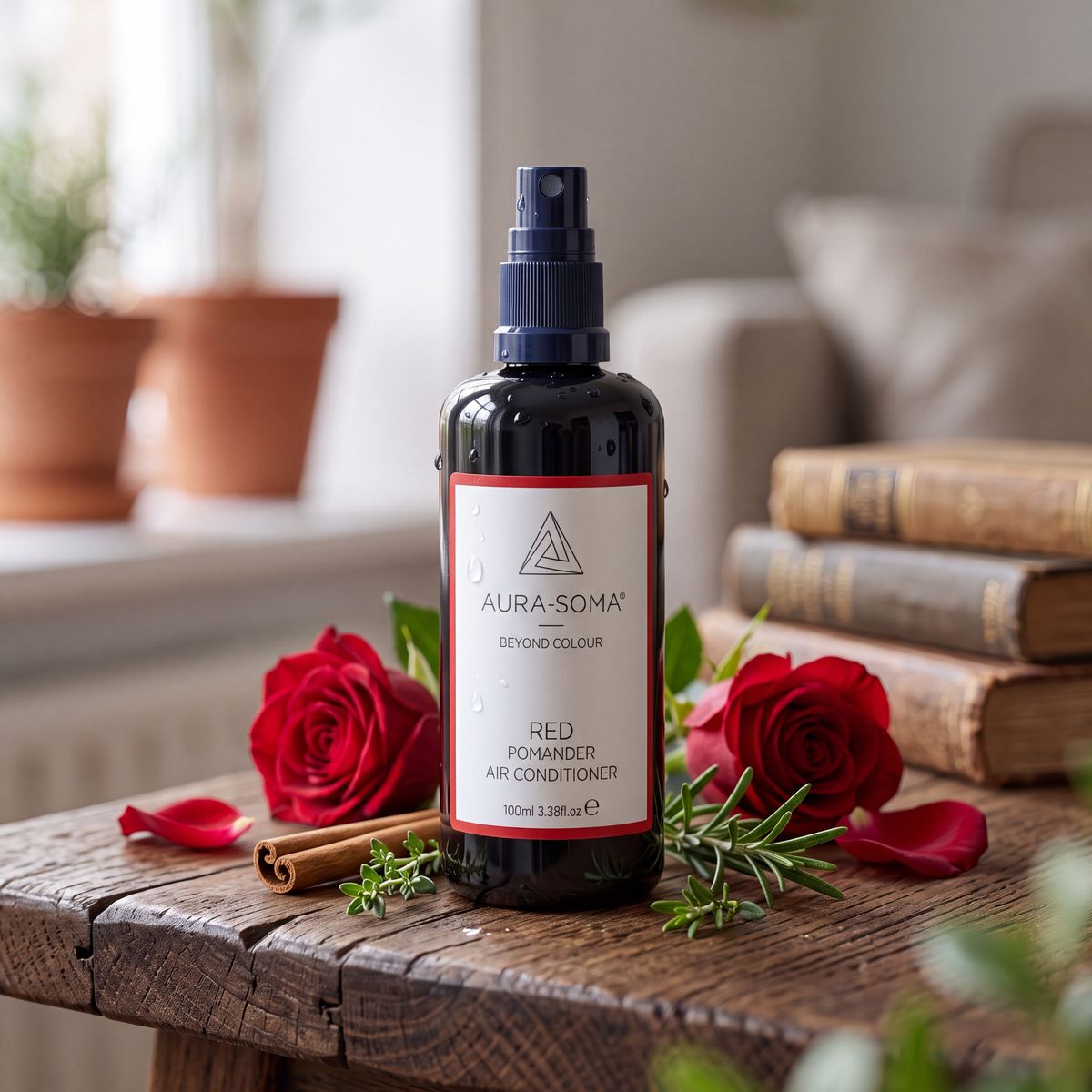
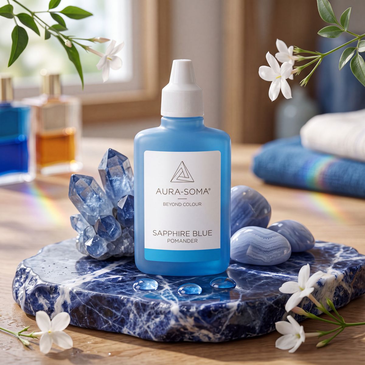
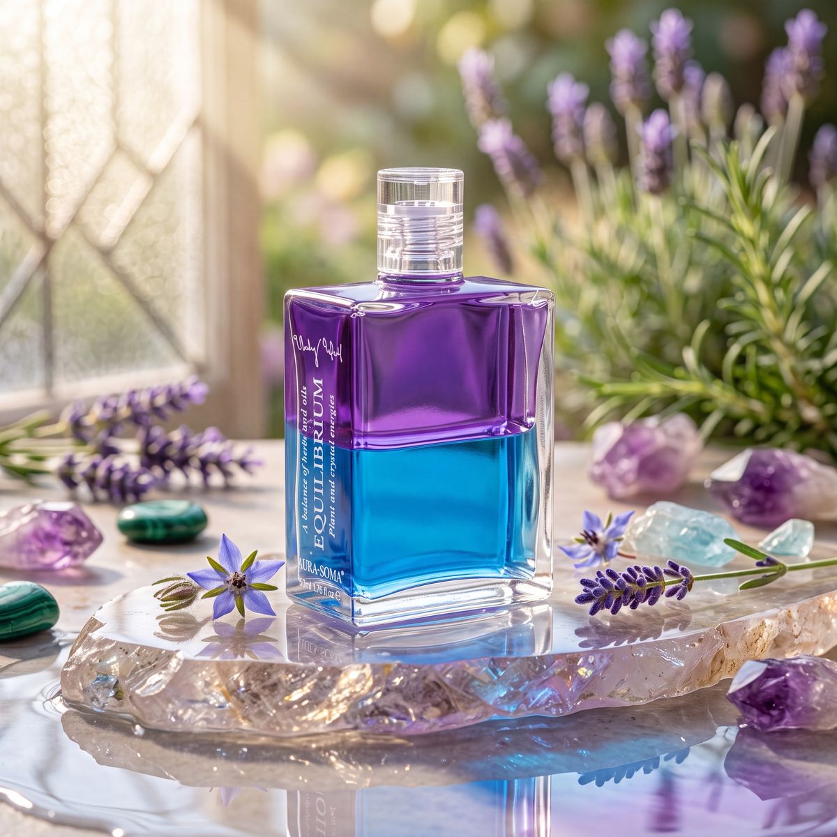
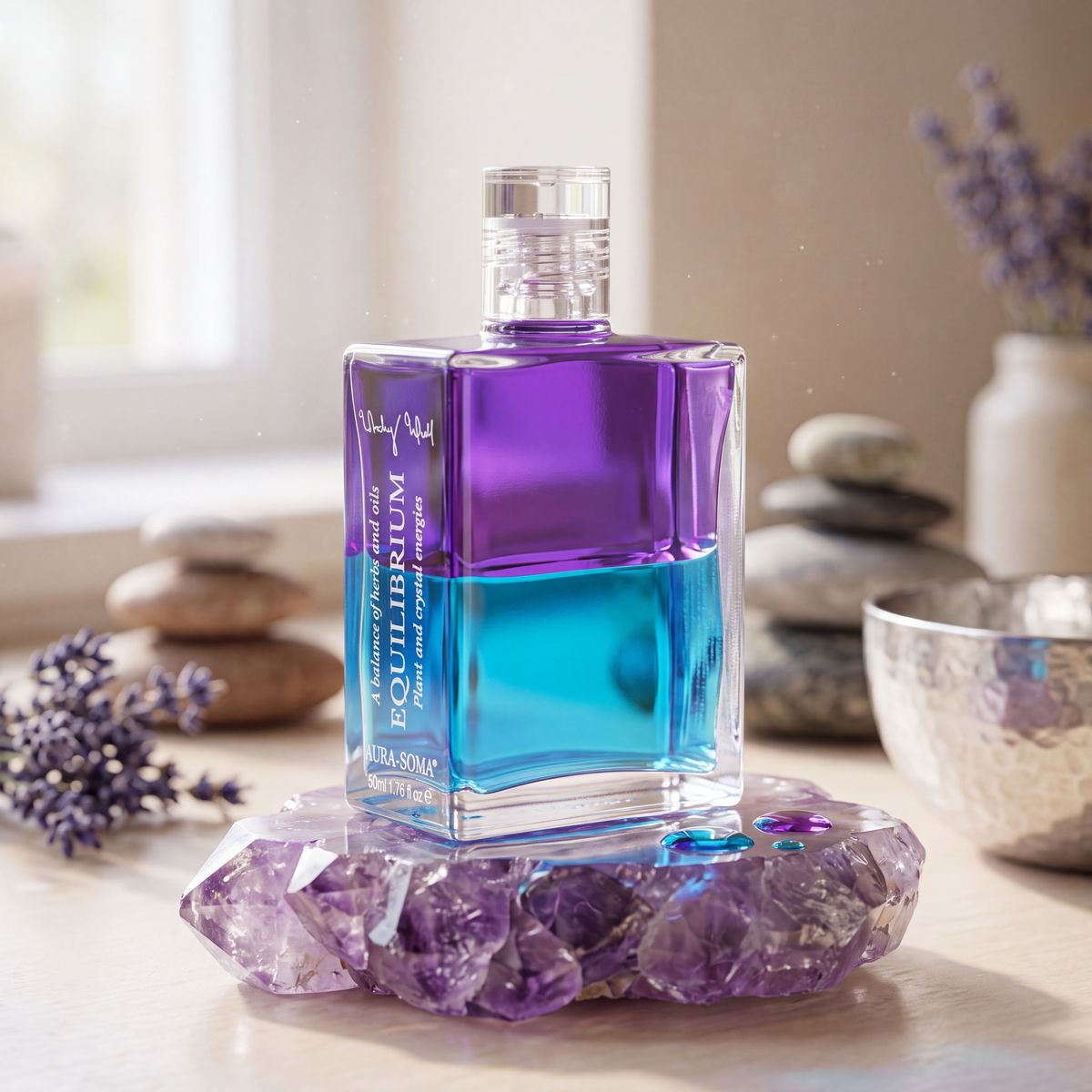
Each scene is art-directed to the product's own color: Red Pomander with roses and cinnamon, Sapphire Blue on sodalite with jasmine, Equilibrium on raw amethyst with lavender. Props, surfaces and light all follow the formula.
The result
A set where the color reads as a system, generated and retouched without a studio, a shoot or samples.